Nib Width on a Real Page: What Changes When the Line Gets Broader
A broader fountain-pen nib changes more than the darkness of a stroke. Learn how width affects letter shapes, spacing and page use—and what to adjust when handwriting starts to crowd or blur.
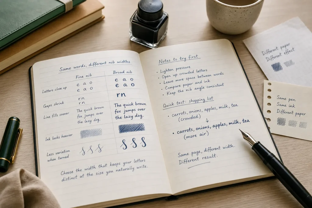
A fountain-pen line that looks crisp on a sample card can turn cramped in a notebook. The nib has not changed, but the page has: familiar letters grow heavier, small gaps close up and a line of handwriting takes up more room. When the writing stops looking comfortable, the cause is often a mismatch between nib width and the way you write, not a faulty pen.
Nib width is only one part of the result. Ink flow, paper texture, writing angle and pressure all influence the line, so it helps to make one change at a time. Start by looking closely at the troublesome letters, then adjust your hand, spacing or nib choice in that order.
Small letters lose their openings when strokes spread
A broader nib lays down a wider stroke, which can make rounded letters look full and confident. It can also fill the narrow spaces inside letters such as e, a and o. If those openings disappear, a word may become harder to recognise at a glance, particularly in quick notes.
First, check whether you are pressing down. A fountain pen should generally write with light contact; added pressure can widen or darken the line and make a broad nib feel unwieldy. Relax your grip and let the pen’s weight do the work. Then write a short row of the letters that are closing up, leaving a little more space within each shape.
If the openings remain crowded, enlarge your letter forms slightly or choose a finer nib for compact writing. A broader line suits handwriting with generous, open shapes better than tightly packed, small lettering.
Try adjusting the letters before abandoning the nib.
Words run together when the gaps shrink
Broad strokes can eat into the space between letters, even when each letter is formed correctly. The effect is easy to miss in a single word but more obvious in a sentence: rn may resemble m, or neighbouring curves may merge into a dark knot.
Look at the spaces between letters, not just the strokes themselves. If they are narrow, slow your hand slightly and leave a clearer gap after rounded forms and tall stems. Avoid pulling every letter into the next one merely because your usual rhythm expects a thinner line.
Say you write quick shopping notes in a pocket notebook, and a broad nib makes “carrots” look like a thick tangle. You could keep the same words and notebook, loosen the joins and leave more air between letters; the expected result is a word that remains easy to scan, even if the line occupies more space. If that change feels awkward or still crowds the page, a finer nib is the simpler fit for that task.
Lines fill the page sooner than expected
A broader nib does not alter the paper’s ruling, but it can make handwriting feel larger. Wider strokes look heavier, and writers often spread letters or add space to keep them distinct. The result is fewer words across a line and a fuller-looking page.
Before switching nibs, write a sample using your normal hand and ordinary pace. Compare the same sentence in the same notebook with a finer nib, if you have one. Notice whether the broader version actually needs more space, or merely looks bolder. A ruled page can help reveal whether letter height is changing; a blank page makes it easier to judge the overall shape.
If you need to fit compact notes into a small margin, a fine nib may suit the job better. If the page is for slower, more spacious entries, the extra presence of a broader line may be welcome. Choose for the writing you do on that page rather than expecting one nib to suit every notebook.
Ink looks too dark or uneven despite a steady hand
A broad nib can make a flowing ink appear especially bold. On some paper, the line may spread into the fibres or look fuzzy at its edges; on smoother paper, it may stay sharply defined. A thick-looking stroke is not automatically a sign that the nib is defective.
Check the paper and ink before changing your handwriting. Write a few words on a different sheet you already know suits fountain pens, using the same pen and a light touch. If the line looks cleaner there, the original paper is likely contributing to the effect. If it remains too heavy, try a less saturated ink or a finer nib, changing only one element at a time.
Also inspect the nib’s contact with the page. Holding the pen at an unfamiliar angle can make the line feel inconsistent, especially if you rotate the barrel while writing. Keep the nib oriented as it naturally rests, and avoid scrubbing the page to force a preferred line.
Line variation disappears when the pen turns
Some nibs produce strokes of different apparent width as the hand changes direction, but the result depends on nib design and writing angle. A broad nib is not automatically a flex nib, and pressing harder is not a safe shortcut to more variation. Extra pressure can strain the nib and make ordinary writing less controlled.
If your letters look broad in every direction, that may simply be the character of the nib. Keep the pen steady and let your usual strokes do their work rather than twisting the barrel to chase a dramatic contrast. If a letter’s thin strokes vanish or its thick strokes become hard to read, simplify the shape and give it more space.
When you compare nibs, use the same words, paper and writing pace. That small, consistent sample makes it easier to tell whether you prefer the broader line’s presence or the finer line’s clarity on a real page.
Choose width by the page and the hand you use
When a line feels wrong, work through the causes in a calm order: lighten pressure, open up crowded letters, check spacing, then compare the paper and ink. Only after those adjustments should you decide that the nib itself is too broad. This keeps a useful pen from being blamed for a problem your hand or page can solve.
A fine nib often makes sense for compact handwriting and narrow spaces; a broader one can suit open forms and deliberate notes. Neither is universally more legible. The best width is the one that lets your letters stay distinct at the size you naturally write, with enough room left for the page to breathe.