Practise Your Hand Without Borrowing Someone Else’s
Study letterforms for their useful details, then build a handwriting practice around your own natural rhythm, spacing and repeatable short exercises.
A handwriting sample can make a capital G look as if it has a single correct shape. It does not. One person’s G may be open and quick; another’s may be compact, looped or plain. The useful work is to notice what makes a letter readable, then practise a version that fits your hand rather than tracing somebody else’s style.
Keep the exercises short and specific. A smooth page comes less from copying a whole alphabet than from spotting one feature, repeating it with care, and checking whether it stays clear in ordinary writing.
1. Choose a real writing job before choosing a style
Start with what your handwriting needs to do. Notes taken during a phone call have different demands from a place card, a shopping list or a journal entry. If you want quicker notes, legibility and an easy rhythm matter more than decorative capitals. If you are addressing envelopes, consistent letter shapes and clear word spacing take priority.
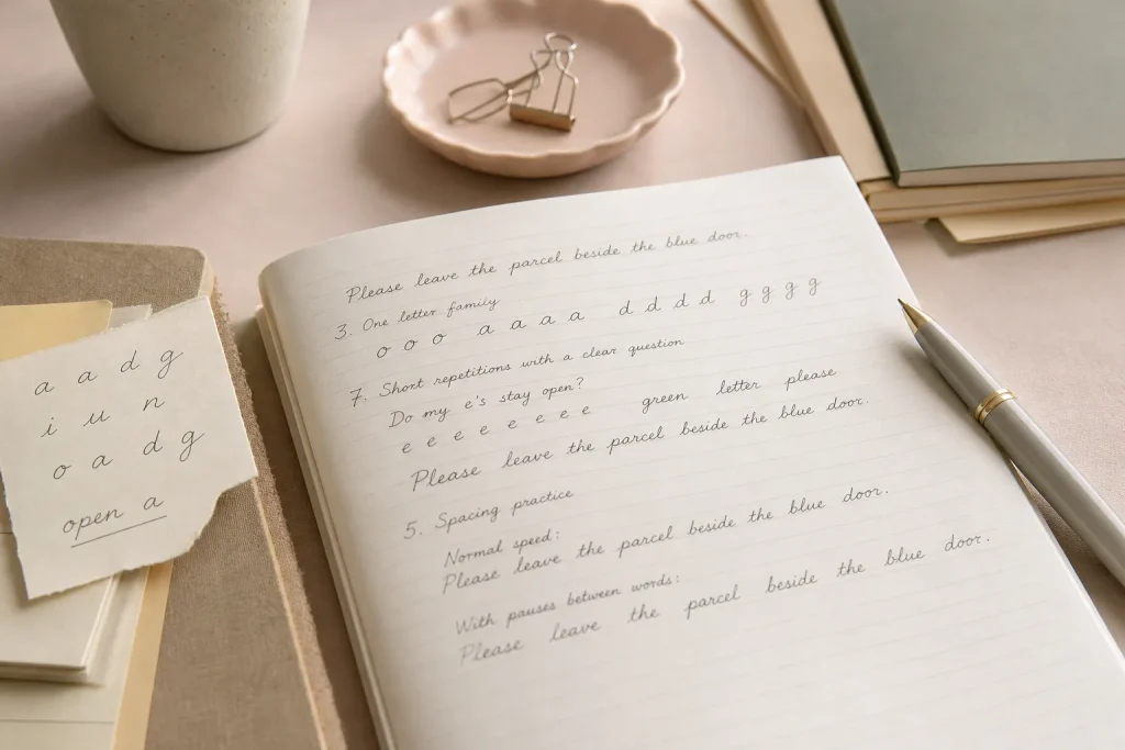
Write a sentence you might actually use for that purpose. It should include a mix of tall letters, short letters and a few joins if you write in cursive. “Please leave the parcel beside the blue door” gives you repeated forms and varied spacing without feeling like an alphabet drill.
Keep that sentence as a reference line. It gives every practice session a familiar task, while leaving room to alter one feature at a time.
2. Collect letterforms as clues, not templates
Look at handwriting you can inspect comfortably: a note from a relative, a handwritten label, a library book inscription or a sample in a lettering book. Choose just one or two letters that catch your attention. Ask what is doing the work: an open bowl, a clear exit stroke, a distinct dot, or a shape that remains recognisable when written quickly.
Then describe the feature in plain language rather than naming the whole style. “The lower-case a stays open” is more useful than “I want to write like this.” The first observation can be tested in your own hand; the second invites you to reproduce a personality, pressure pattern and movement that belong to someone else.
There is no need to copy a complete sample. Borrow a principle, then make a new letter with your own proportions and movement.
3. Set a comfortable starting position
Before judging letter shapes, settle into a position you can repeat. Rest the page at a slight angle that suits your writing hand, let your forearm move freely, and hold the pen lightly enough that your fingers are not clamped around it. A familiar pencil, ballpoint or fountain pen is fine; the point is to practise with a tool you can use without fighting it.
Write a few ordinary words and notice where the motion feels strained. If your wrist locks, your grip tightens, or the line becomes shaky as you press harder, pause and adjust. A handwriting session should not turn discomfort into a style choice. Persistent pain or difficulty with writing is a reason to ask a qualified professional for advice.
Choose a position that lets the pen travel without a hard squeeze.
4. Find a repeatable size by writing a sentence
Letter size is easier to judge in words than in isolated strokes. Write your reference sentence at a relaxed pace, then look at the height of short letters such as a and e beside tall letters such as l and h. You are not looking for a prescribed ratio. Ask whether the short letters are large enough to stay distinct and whether the tall ones crowd the line above.
Make a second line with slightly smaller letters, then a third with slightly larger ones. Compare the versions from a normal reading distance. Keep the size that feels clear without making your hand work conspicuously hard. If you use ruled paper, let the lines guide consistency, not dictate a particular alphabet.
Once you have a comfortable scale, repeat it in a few everyday words before changing another feature.
5. Practise spacing as a relationship between words
Letter spacing and word spacing have different jobs. Letters need enough room to remain identifiable, while gaps between words help the reader find the next unit. A row of beautifully formed letters can still be tiring to read if the words run together or the gaps vary wildly.
Write a short sentence at your normal speed and look at the blank spaces, not just the ink. Notice whether the gap after a wide letter such as m differs from the gap after a narrow i; some variation is natural. The practical question is whether the spaces between words remain visibly larger than the spaces within them.
Try writing two versions of the same sentence. In one, make a deliberate pause between words; in the other, use your usual rhythm. Keep the version that reads clearly without making the words feel disconnected.
6. Work on one letter family at a time
Letters with related movements make useful practice groups. Rounded forms such as o, a, d and g can help you notice how consistently you close or leave open a bowl. Letters built around an entry stroke, such as i, u and n, offer a chance to examine spacing and rhythm.
Pick a single family and write a short row slowly, then use the same letters in familiar words. A line of isolated ns may look even, but that does not tell you whether the humps remain distinct in “morning” or “planning.” The word is where shape and spacing have to cooperate.
Do not polish every member of a family at once. Choose the letter that most affects readability and leave the rest alone for now.
7. Use short repetitions with a clear question
Repetition helps only if you know what you are watching. Instead of filling a page with the same word, decide on a question: Does the top of my t stay at a similar height? Do my rs remain open? Can I tell an e from a hurried c? Write a small row, inspect it, and adjust one thing on the next row.
Imagine you notice that your lower-case e closes into a dark loop when you speed up. You could write a short row of es with a lighter touch, then put them into “green,” “letter” and your reference sentence. The visible result to look for is an opening that remains readable in words, not a row of identical shapes achieved by slowing to a crawl.
Stop the exercise when your attention fades. A few deliberate repetitions are more informative than a page of automatic marks.
8. Compare samples without grading your personality
Keep a small record of practice lines, dated if that helps you compare them. Use the same sentence now and then, but do not treat each page as a verdict. Handwriting changes with the surface, the pen, your pace and the reason you are writing. A quick note and a carefully addressed card need not look identical.
Compare one feature at a time. Are word gaps easier to follow? Do the letters you targeted remain recognisable at your usual speed? Does the page feel less effortful to write? These questions give you practical information without turning neatness into a measure of character.
If a change makes the writing slower or more tense without improving clarity, set it aside. You can return to it later, or decide it simply does not suit your hand.
9. Carry the practice into an ordinary page
A drill earns its place when it transfers to real writing. After practising one feature, use it in a short note, a journal paragraph or a list you genuinely need. Keep your attention on the chosen detail, but let the words move at a natural pace. If the feature disappears as soon as you write freely, make the next exercise smaller rather than demanding a full transformation.
For instance, if you have been working on clearer word gaps, write a brief note to yourself and check whether you can scan it without guessing where one word ends. If it remains readable, keep using that spacing. If not, return to a few short lines and adjust the pause between words before trying again.
Choose one small detail for the next session, and let the rest of your handwriting stay yours.